The Horror genre contains an array of conventions which help to establish products as part of the genre from commonly used imagery/character roles to narrative structure. An audience is then able to identify a product of the genre as they become familiar due to exposure of these elements. However, products can try to go against these conventions, or potentially develop existing ones/ create new ones. While our trailer tries its best to stick to these conventions, we have both used and broken these standard conventions whether that is intentional or unintentional.
TRAILER
Hamidat Adesina
- Genre: the way of categorising film based on the similarities and matching codes and conventions used. Or there theme, setting and mood, the same can be said with the audience that they all aim to market to.
- Sub genres are the specific to the genre itself. For example, in a psychological thriller, there is very tense music, dark lighting, long pauses.
- Due to the nature of familiarity of the recognisable elements the audience have certain expectations. This is especially the case when it comes to a genre such as horror that has so many familiar elements, because of the typical symbols, signs and overall signifiers and elements involved in the genre they have been conditioned to want to see certain things. For example, they expect to see a jump scare, they expect to hear a rising tone that creates and gradually elevates tension, they expect to see some sort of weapon that is an iconic symbol for a phallic object i.e. a knife.
LENGTH

In our trailer, we have decided to follow the basic structural length of most horror trailers, which ranges from about 0.50 seconds to 1.30 minutes. Our trailer comes to a total of 1.05 minutes. Following the typical length of horror teaser trailers allows the product seem more realistic, as it is not 'too long', or 'too short', keeping the viewer interested throughout.
|
This is an example of a recent teaser trailer, and it is the exact same length as our trailer, showing that we have tried to make everything look as realistic as possible, as most horror trailers are quite short, as they want to keep the viewer wondering what is going to happen.
|
|
|
In terms of the animatic, we did not follow the complete structure of it, as we decided along the way that removing/adding certain things to the trailer would make it look better, we had also changed the timing of certain parts.
Initially, our plan was to include a family in the trailer, but we then decided to focus more on the conflict between the masked man and the female protagonist in order to interest the viewer more, and give them a clearer understanding of the storyline. |
TODOROV THEORY

Levi Strauss - Binary Oppositions
Some of the Binary oppositions that we have used throughout our trailer are, antagonist vs protagonist and male vs female, between the two characters. This is been done to show the power someone can have and although the protagonist looks scared, they defeat the antagonist towards the end. This convention has been followed as we have also used the fact that the protagonist is a female and the antagonist is male. This is predictable and used in most slasher films as the antagonist is evil, and portrayed as strong and powerful due to his masculinity and the final girl is portrayed as weak as shown that she is hiding from the masked man.
|
|
|
|
We have dismantled Todorov's theory, by not having much of an
equilibrium, having a disequilibrium, but no restoration of equilibrium. Equilibrium - Showing the setting of the place, no action or disruption has happened yet. Disequilibrium - The girl has become possessed by the doll, after the masked man has done his work on them. She is trapped in the cell, and cannot escape. The cell is a representation of her mind, which she cannot escape from. Resolution/ New equilibrium - As it is a horror trailer, there is no full resolution. Our trailer does not include a new equilibrium, or a resolution. |
Real media texts also follow a similar structure, focusing more on the disequilibrium rather than the equilibrium, and not including a resolution.
Equilibrium - Showing the detective around the insane asylum, telling him the backstory of the island. Disequilibrium - One of the most dangerous criminals on the island has escaped, it is up to the detective to find them. Resolution - There is no resolution shown in the trailer, ends with a jump scare. |
CAMERA TECHNIQUE
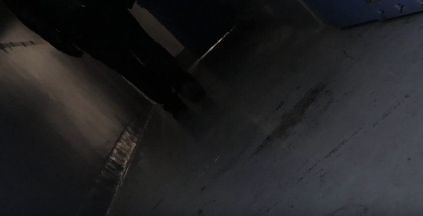
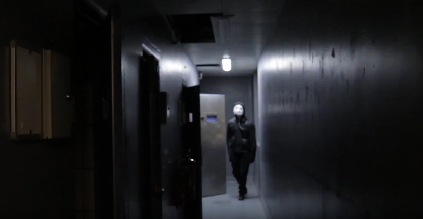
High angle shots have been used a lot in our trailer, to connote the feeling of someone superior watching. In our trailer, the masked man is the most superior.
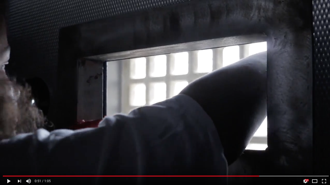
Canted angle shots have been used to make the viewer feel unease, as the angle is tilted. Additionally the fact that we can only see the person's feet whilst they are coming towards the camera helps to build the tension.
|
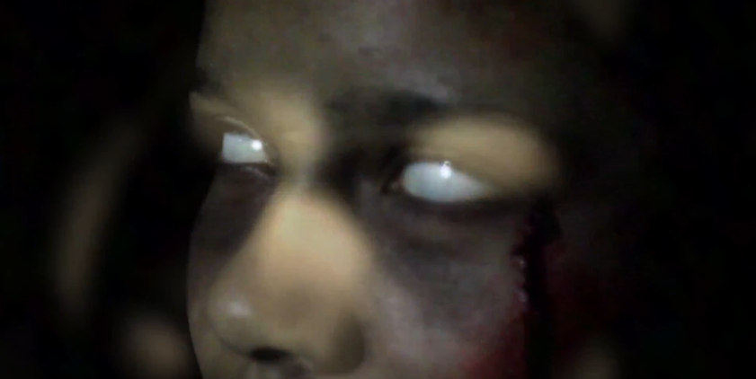
Close up shots have been incorporated in our trailer, to show off certain details such as blood on the characters face. Close up shots also connote the feeling of being enclosed, trapped.
The use of the long shot in this particular part of the trailer (the ending), helps to increase tension, as the lights are flickering, the sound of building up, it should have the viewer wanting to anticipate what's going to happen next.
|
Props & Conventions Used In The Trailer
|
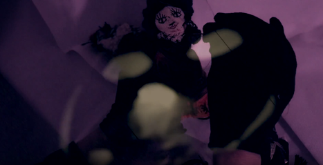
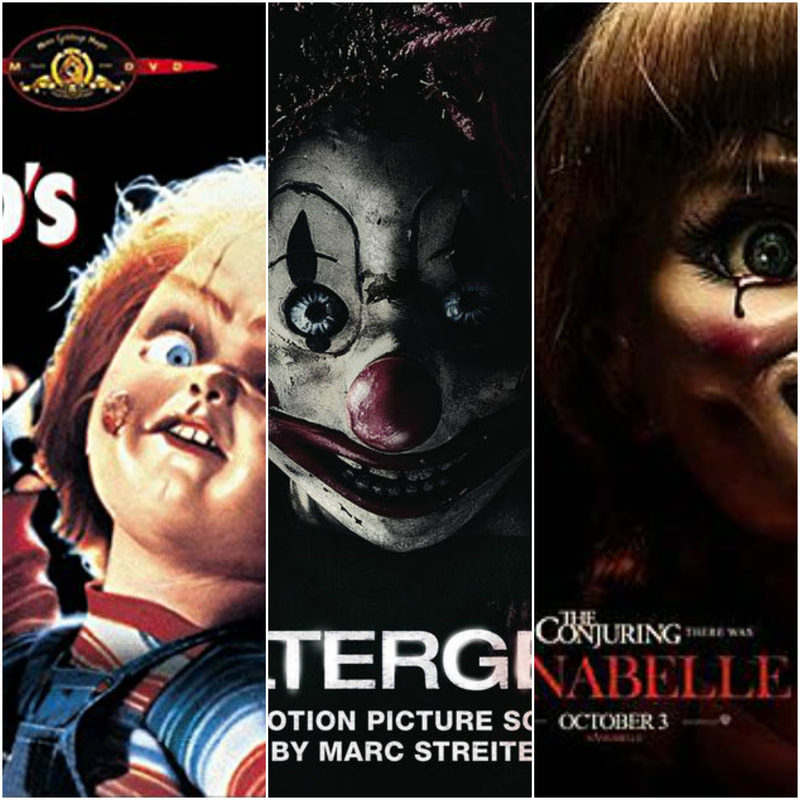
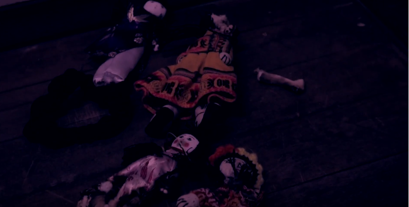
The use of a doll in our trailer is quite effective, as it connotes the possession of the protagonist, as she was playing with these dolls in the beginning of the trailer, before the full disequilibrium occurred. Dolls are a common convention/prop in horror movies, because dolls are typically supposed to connote youth, innocence and purity, but in horror films, dolls are usually the antagonist, for example, Chucky, Annabelle, the Poltergeist etc. so to have a doll in our trailer gives off a negative connotation, and people that like horror movies that include dolls may like our trailer.
|
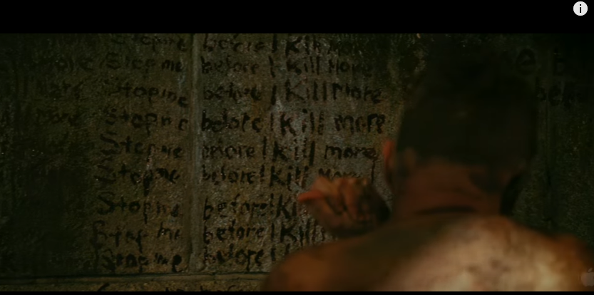
Using a mask in a horror film is very conventional as this hides the identity of the antagonist which creates a sense of mystery to what the antagonists history may have been like which also would reveal why he's in a mental state killing his victims. The identity is hidden in the trailer so that this catches the eye of the audience as the mask is broken and if covering the antagonists face slightly, but where its not there are scars which leads to the subtext behind the film and that's revealed in the full film. I have followed this convention as the identity of the antagonist has to be hidden in the trailer as if its not It would give to much away that the audience would not want to see the film as it would be predictable and not as jumpy as they no what the villain looks like.
|
LIGHTING
|
|
|
|
|
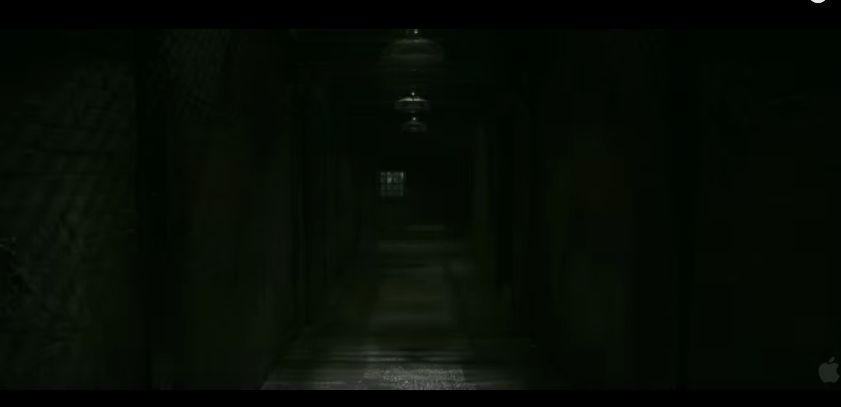
Low-key lighting is a convention in horror movies, and it is used to connote the feeling of e dark, evil, eerie presence, so that the viewers can feel unease. The use of low-key lighting in our trailer can be linked to to the masked man, as he is a dark, evil presence.
|
These are examples taken for real media texts, showing that low-key lighting is important when trying to set the mood and tone, which is scariness, tension. Additionally, this trailer has included a green tint, whilst ours has included a purple tint, showing how we've developed conventions.
|
|
This is what the original clip looked like before the editing, and it does not look as scary, or as eye catching as it could be. The conventions we have used in this are the dolls and the blood. The mask is also laying beside her, connoting that this is how she got possessed.
|
|
The clip has now been edited, and there is a dark purple colour effect, which makes our film look more unique, whilst adding a scarier touch to it. This dark purple tint is different to other horror films I've seen, as this has never been done before. The closest comparison can be taken from the psychological thriller, Shutter Island.
|
|
|
|
|
|
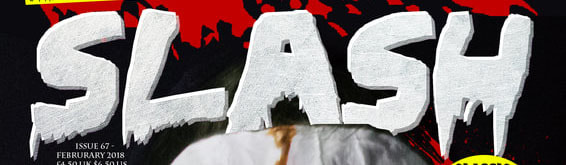
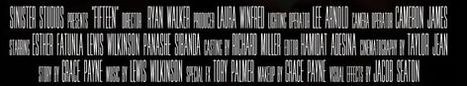
Throughout my trailer I have consistently used the same type face as thesis predictable and easy for the audience to take notice of it. I have used a scratchy blood colored font symbolizing blood, danger, etc. which is a conventional color to use for a title in the horror genre, and our trailer does involve some blood. At the end of my trailer the billing block has been placed, which is also a convention in some film trailers as it marks the stars, producers/ main people involved in making the film.
|
A Nightmare on Elm Street includes typical conventions of horror films, using conventions that are mostly used to symbolize blood, death, danger, violence, etc. This is also a contrasting color that stands out well again the other colors, especially the black/ darker areas which is also used a lot in horror films to create the tone/ emotion and is therefore more eye catching.
|
Shutter Island is a psychological thriller, and it includes some typical conventions of horror films, having a black background, but having white text, highly contrasting with the darkness. Similarly , our trailer uses some white texting, contrasting with the fairly dark background.
|
|
The Gradient effect convention is mostly used in psychological films (For example, The Conjuring 2 Trailer) This effect also connects to the subtext behind my film, as they are all being watched due to the judgement of younger by the society and therefore has that CCTV footage look.
|
Conclusion
In conclusion, I believe that all of these conventions we have included in our trailer have been portrayed successfully, and have helped us to build a very professional-looking piece of work. These conventions are needed in the trailer, to make it as recognisable to the viewers possible that our trailer is a psychological, paranormal horror. However, to improve I believe that we could have incorporated extreme close-ups, to completely emphasise the feeling of being trapped, which would have come across as more obvious to the viewers, as they may not understand that she is trapped inside of her mind.
MAGAZINE
Lewis Wilkinson
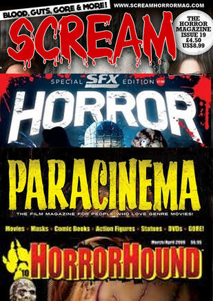
Based on our group’s research into the conventions of magazines in the horror genre, we chose conventional typography and colour schemes similar to those of existing products. We were heavily influenced by the style and layout of ‘Scream’ magazine.
Masthead
 |
|
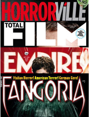
Examples of RMT
|
|
Similarly to these conventional mastheads, we have chosen a bold white font against a dark background. we have taken inspiration from empire's date and price placement inside the 'M' by including our date within the C.
Cover line
Character
POSTER
By Grace Payne
Film Title
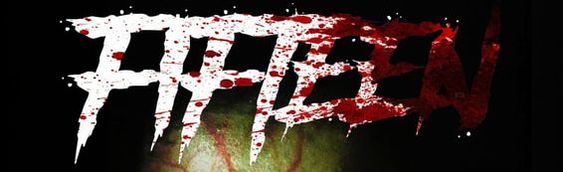
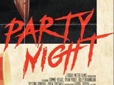
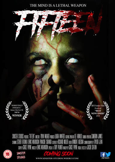
Since the sub-genre of our horror film is a psychological mixed in with a slasher it was difficult to come up with the elements on the poster so that the audience could recognise it fitted into both categories. However, with the film title it was definitely successful in adding the slasher aspect to our poster. For example, the blood splattered effect adds a sense of gore and violence into out film and highlights to audiences that props such as knives and sharp weapons will be used in the trailer. The white font symbolises a sense of innocence within in the film and represents the young female character within the movie. Since the blood covers up this colour, it gives an insight to the story line as it is in fact the protagonist who becomes the killer, who can almost be seen as the 'final girl'. The side by side comparison below between "Fifteen" (our own product) and "Party Night" a 2017 slasher horror, shows the conventional font used; which symbolises a splatter or a blood written on a wall type image. So here, we have definitely conformed to the stereotypical elements in the sub-genre but have developed them by using different colours that connote a deeper meaning which relates to our storyline.
|
|
Dominant Image
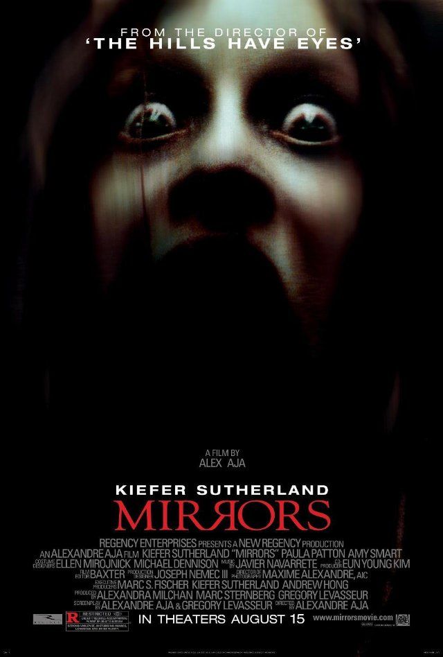
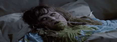
When looking at the dominant image on my poster we have also stuck to the conventions of the general form and structure but also the conventions of the sub-genre too. For example many psychological horror film posters use a close up shot of their main protagonist's face to make the poster more visually enticing to audiences, this also takes up a lot of the page and is the focal point of the poster. With many dominant images in the horror film genre, there is a conventional effect used to add a sense of enigma into the story behind it; which links to the Roland Barthes theory, and is denoted through the use of the fade to black from the middle to the outer corners and sides of the poster. What's more the typical colours can be very basic, generally sticking to a red, black, white and dull grey and brown colour scheme. However our poster is a lot more bold in colour compared to the real media text down below as we have added a green filter to our image; which was done to link in with the possession theme that runs through the film similarly to "The Exorcist", where the main protagonist becomes possessed by a spirit and her face has a slight green colour in it. This perhaps helps highlight the idea that our bodies almost try to get rid of the demon inside by vomiting, hence the use of the colour green.
|
|
Billing Block
Another convention that we have stuck to in regards to our horror film poster, is the use of the billing block just above the release date. The main reason why billing blocks are used in posters is to give credit to the producers, editors, actors/actresses and so on, who have worked on the film, therefore each of these can change depending on how many people the billing block includes but ultimately the structure stays the same to ensure the audience can recognise it. However, most billing blocks in horror films tend to use a dull grey coloured font for their billing blocks, but we have decided to use a brighter white shade. This was done intentionally to stick to our consistent house style throughout since the colour grey is not excessively used in any of our other media products. Therefore, whilst conforming to the conventional form we have also developed it and I believe it ties in with our aesthetics a lot better, making our final product a lot more professional looking.
|
|
Website
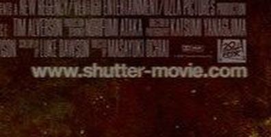
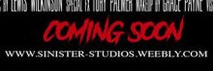
In addition, many horror movie posters are now including their website for the trailer to help in the marketing campaign of the film. This convention allows audiences to interact with the advertising of the movie and gives it more publicity through word of mouth; which will therefore increase ticket sales and the success of the film. However in most horror posters the website is in a very small font and generally matches the font colour used for the billing block, so that nothing takes away from the focal points of the poster, the title, the dominant image and the tag line. Therefore, in my work I have chosen to stick with the white colour scheme to continue the house style and increase its aesthetics. Whereas the real media text of "Shutter" has chosen to stick to their scheme of a dull and washed out red colour perhaps trying to symbolise a dried up blood image.
|
|
Inspiration from Genre Conventions


Conclusion
Overall, the mix of conventions used within our horror poster help to highlight to audiences the different sub-genres we based our story around in our film as we have managed to include different elements from each such as the slasher inspired title and release date, the simplistic tag line and the psychological inspired image. However to improve this I believe we could of added something else to help make the combination of genres more recognisable, for instance the use of a prop such as a knife and an image that includes the protagonist wearing the white gown which we dressed her in in the trailer, would give the dominant image more conventions and codes that our target demographic can instantly identify. But through the mix of medias we have produced and the fact that a masked antagonist is used on our magazine front cover, adds to the idea that our film falls under the slasher sub genre and reinforces all of our ideas.
