The purpose of collecting audience feedback is in order to make sure that our target demographic has an input the final product that is being produced by SinisterStudios. By getting people to view our products we are able to see the strengths and weaknesses of our own work and also able to see if it does in fact appeal to our target audience, and see what we can do in order to make our trailer even better.
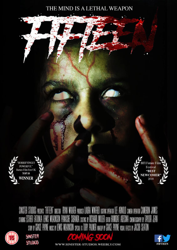
Poster
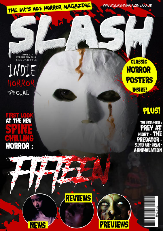
By Grace Payne
Poster reaction video
From rewatching the video the majority of the responses matched with the data we found from the questionnaire we created and overall there was a great positive response to our product. I believe from this information we have conformed to the stereotypes of horror film posters extremely well since our poster follows the similar layout, colour scheme and typography style to most slasher/psychological horror films today; which therefore means that our product can be recognised by the majority of horror film fans.
Survey monkey questionnaire
|
The survey monkey on the left is what our team used to retain research from our target demographic, by asking people through apps such as WhatsApp, iMessage and Snapchat to answer the questionnaire. Over all, the feedback we received matches the final product we created for our poster as we made sure to include everything that our target audience wanted us to, to also stick to the generic conventions of the horror genre and what is popular with teens today.
|
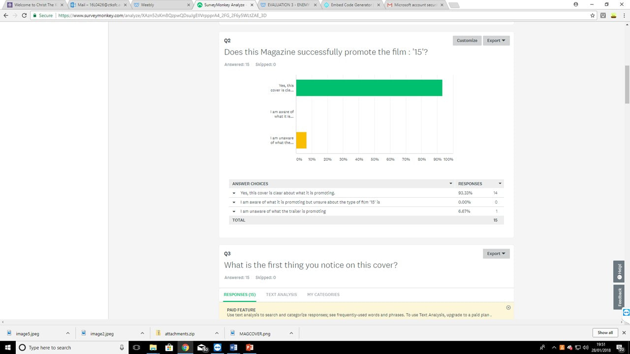
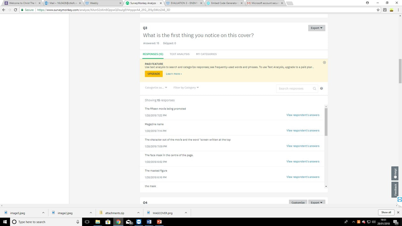
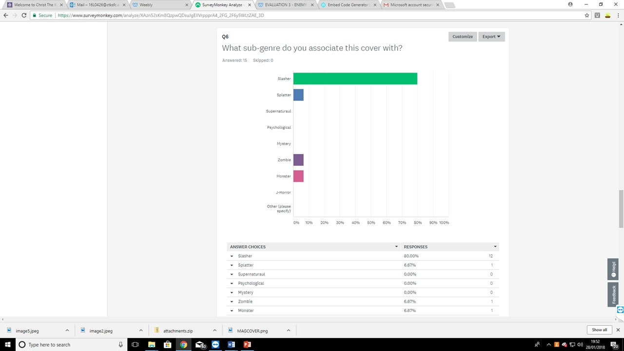
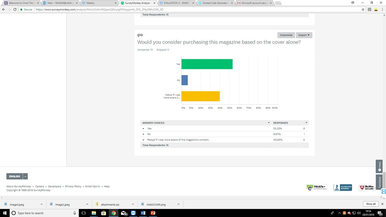
The images above highlight the responses we received from all of the questions we came up with, however there were a few other questions that asked the person themselves to write a response and were not multi-choice, therefore each of those answers were very different but we still went with the majority vote. Whereas the questions above, have more specific answers; which help us find out precisely what guidelines our poster must follow. For example, in Question 10 just over 80% of the people we surveyed stated that one person in the image is much more common than more than one as it is clearly a stereotypical factor that horror genre posters include and tend to stick to. This is the reason why we chose to use our main protagonist as our character as it also helps to make her the focal point of not only the poster. but audiences can clearly deduce from this that she will be very important in the development of the story in our trailer as well.
What's more, Question 2 also states asks our audience whether people feel that our magazine colour scheme should match well with our poster. At first this was not very successful, because the bold greens and reds and almost purples in our poster could not be seen on the front cover of the magazine; which can be seen below. However, with improvements by adding a green over lay and including smoke and also the prop of the doll, it flows a lot better and can be more recognisable when comparing our magazine and our poster. It was important that we made these changes because it continues the professionalism of our final products, which is an element that we believed was key to be able to achieve the highest grade possible. Furthermore, since the vote was unanimous by our demographic it was something we had to stick to in order to appeal to them.
Poster |
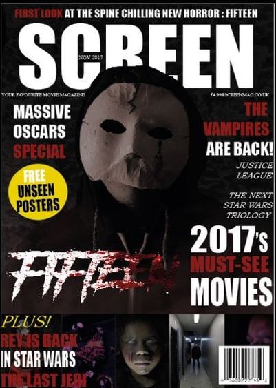
First Magazine Draft |
Final Magazine |
With Question 7 the responses we found made it difficult to decide what answer we would go with for our final poster. The results were split 50/50 therefore the question had conflicting views. However because of this, we chose to do some more research on horror film posters and also look back at the main conventions we found in our research and planning stages. Overall, we decided to go with the close up of our main character's face and this is what seems to be the most typical type of camera shot that is used on the majority of posters and what works well with our particular story line in our trailer.
What's more, with question three there was an 100% result to keep the copy on our poster simplistic, therefore this does not include the title as that completely goes against this answer. However, the producing credits, the tagline,and the copy used within the award laurels all stick to this idea. This is due to the fact that it does not take away from the title or main dominant image as these are our two main focuses of our poster and are the most important components into making our poster recognisable to the public, as well as also helping our production team to make a brand identity for ourselves.
What's more, with question three there was an 100% result to keep the copy on our poster simplistic, therefore this does not include the title as that completely goes against this answer. However, the producing credits, the tagline,and the copy used within the award laurels all stick to this idea. This is due to the fact that it does not take away from the title or main dominant image as these are our two main focuses of our poster and are the most important components into making our poster recognisable to the public, as well as also helping our production team to make a brand identity for ourselves.
|
|
|
Social media responses
In the slideshow above, I show the different apps in which we advertised our survey across and got people to answer it. The advantage of using all different types of media helps me to reach a wider target demographic and therefore my results can be a lot more accurate as a representation of all the teens in the UK; since the majority would feel the same. The main apps I chose were Whatsapp, Snapchat and iMessage as these are all apps made for instant messaging therefore people are notified when they receive a message from me and it allows them to respond whenever/wherever they are; which means I can communicate with people from all over and they can fill out our survey no matter what they are doing.

Conclusion
Overall, from the feedback we received we have been successful in being able to use the information we have collected from our audience questionnaires and make sure our poster specifically includes conventions and elements that make it identifiable to the horror genre as well as identifiable to our other media products we have made, such as our magazine. This was done through the use of picking a demographic that we knew we already fans of the horror genre and since many of them watch horrors quite frequently, they are the ones who we needed to impress and who would be great to gain feedback from, due to the fact that they would be very well educated in what makes a good horror movie poster.
Magazine
Lewis Wilkinson

In order to recieve feedback to improve my Magazine design, I produced a surveymonkey, providing questions which help me to establish what worked and didn't work in my design. I shared this survey through Whatsapp, Twitter and Instragram to people in the 15-19 age demographic (our target audience). the questions included in our survey reflect the conventions of real media texts, and what consumers look for in a product.
|
|
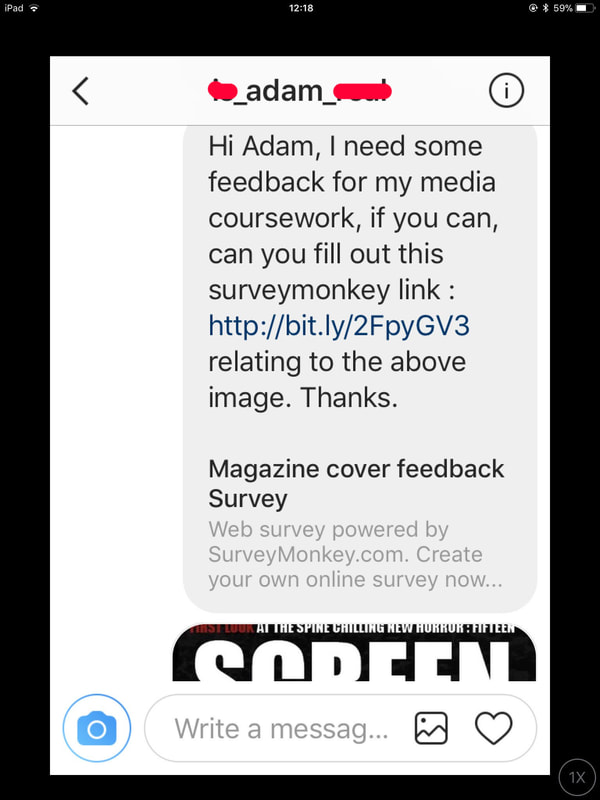
In order to make people aware of our SurveyMonkey, I provided a link and a reference to the magazine cover through direct messages on social media services such as Whatsapp and twitter.
Magazine cover feedback Survey
Web survey powered by SurveyMonkey.com. Create your own online survey now with SurveyMonkey's expert certified FREE templates.
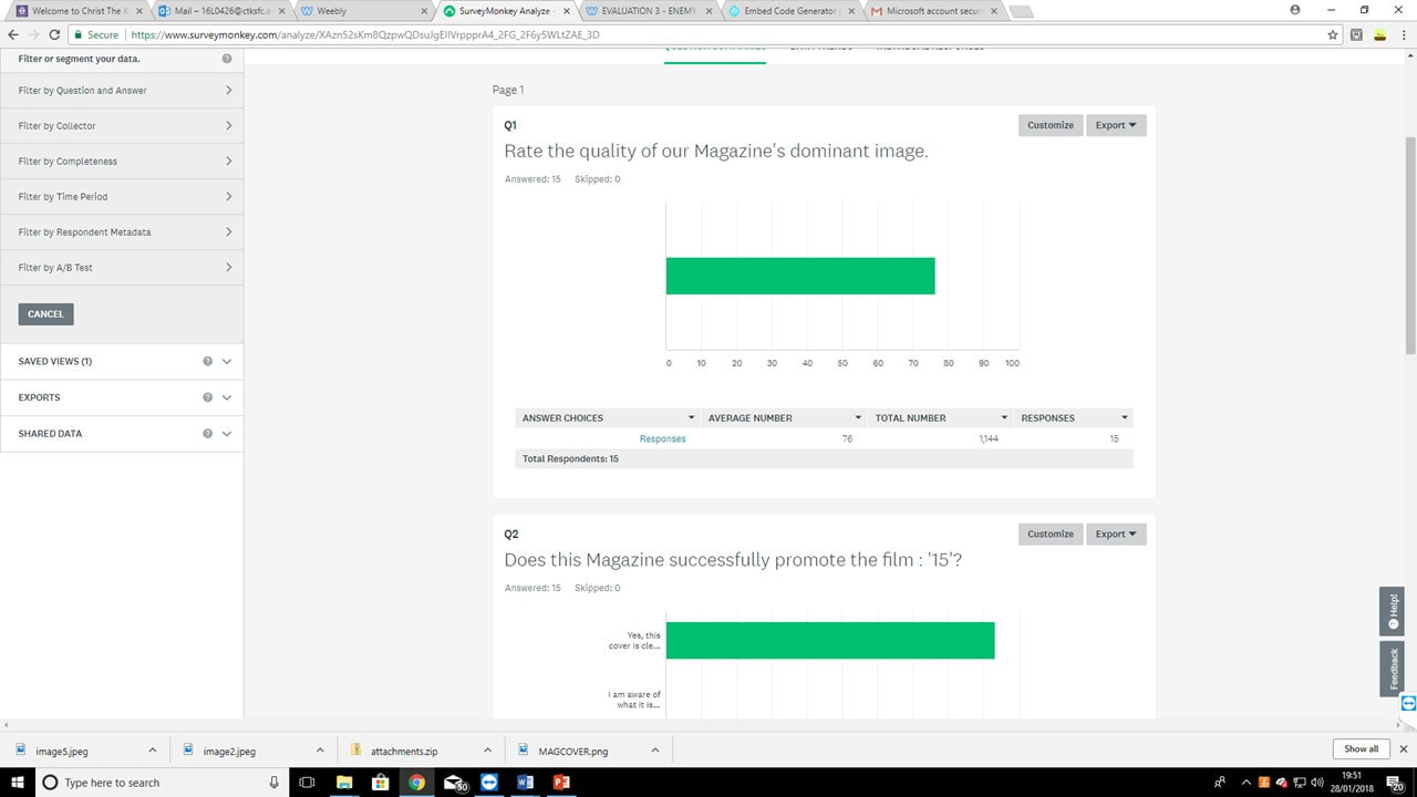
Overall, 15 individuals have participated in my survey by the time this has been posted. above displays just some of the responses to my survey. These results have helped me to identify the cover's strengths : (The ability to promote the product, the dominant image, choice of colour, correct sub-genre etc.as well as highlighting the product's flaws.
|
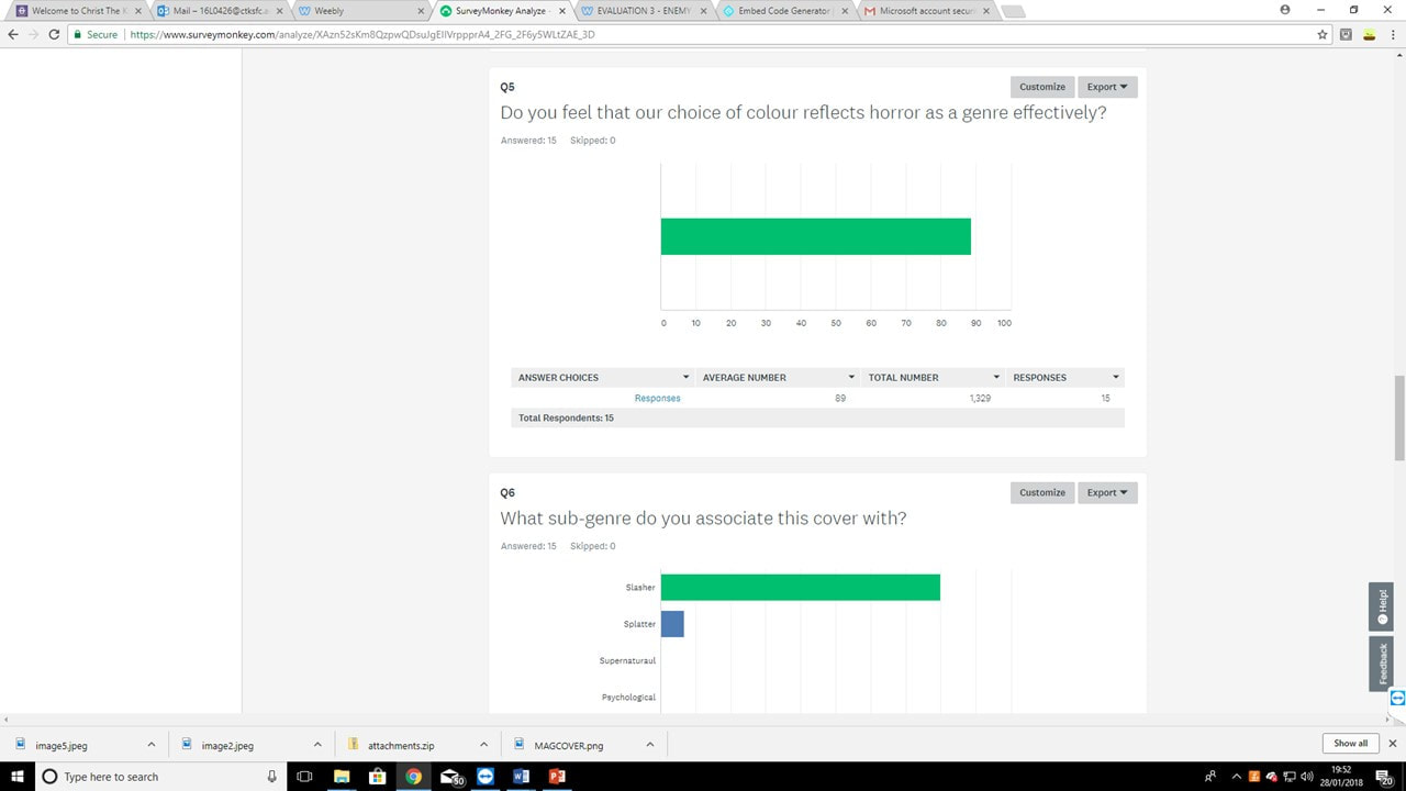
Through the results of our first question, It is clear that the answers suggest that they feel we have chosen a high quality image, as on a scale of 100, the general rating is 75. however, this still leaves room for improvement, which has been taken into consideration in the final design.
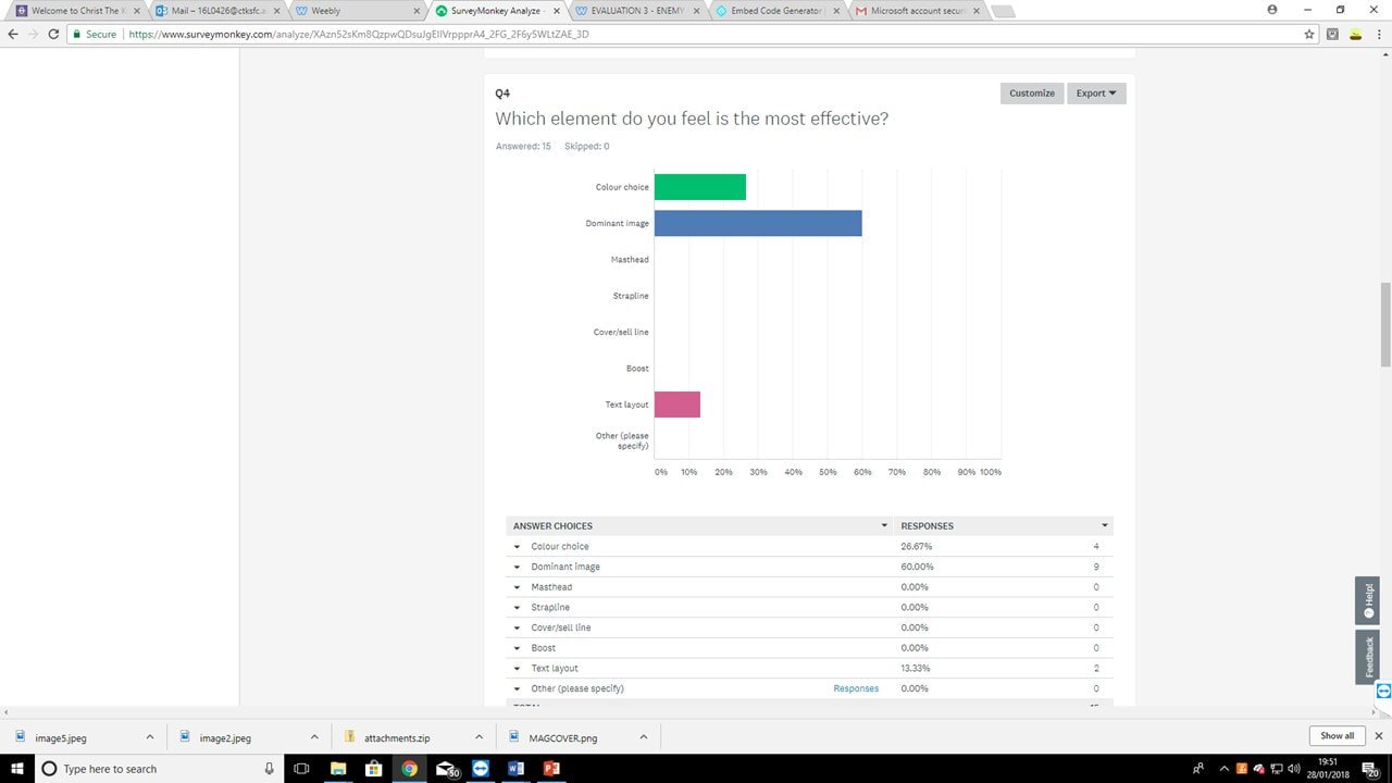
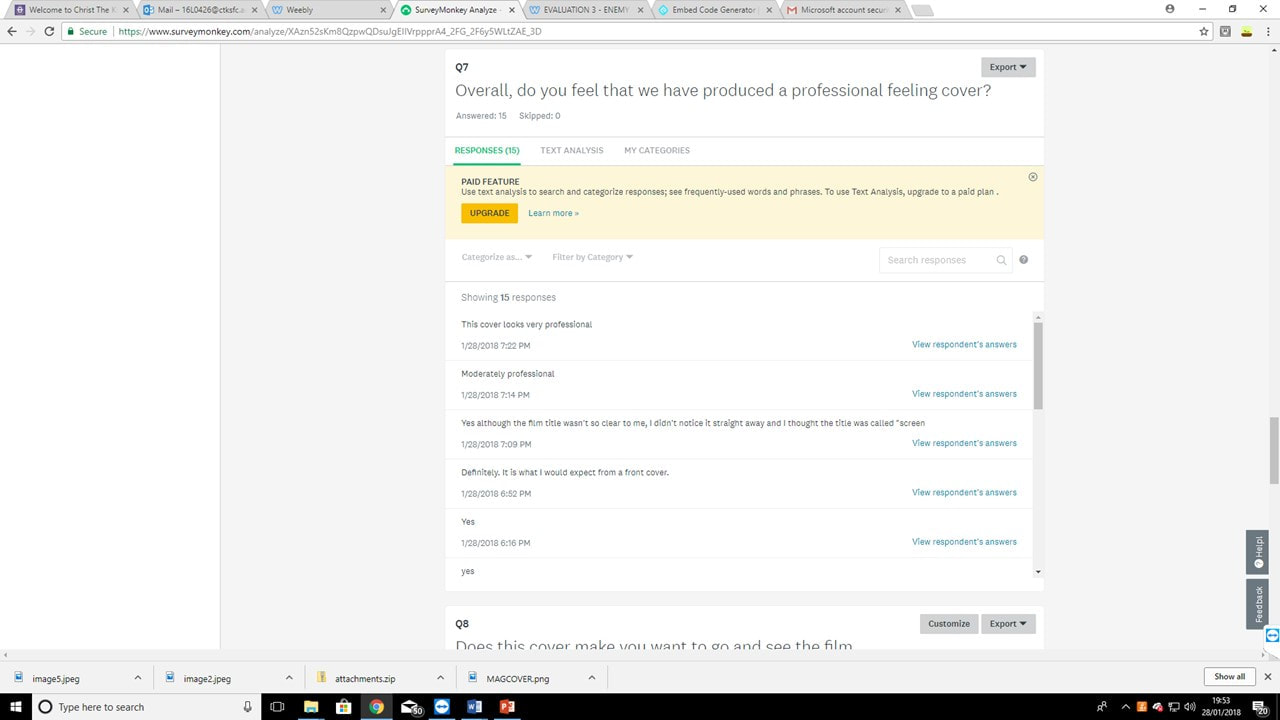
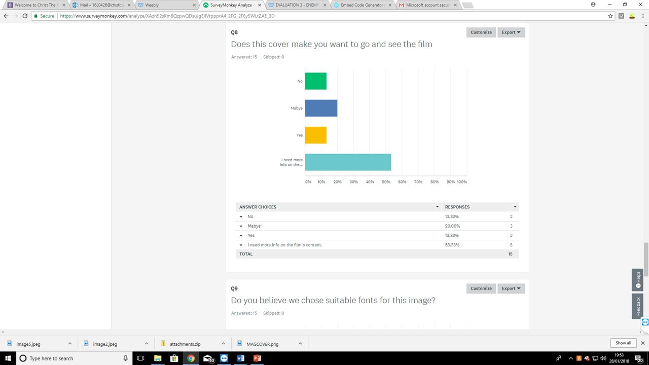
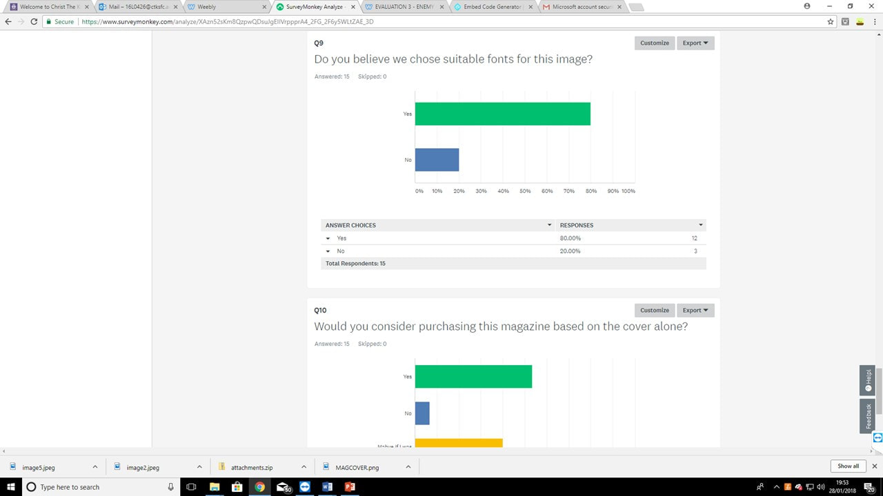
Through the results of our second question, it is clear that out of the 15 individuals viewing the image, the majority were in the clear about what our magazine was aiming to promote. due to this result, we decided to leave the imagery of the film's logo generally the same on our final design. From the responses I've received for the 3rd question, generally most people felt that the dominant image was the strongest aspect of the page overall. while this was good to know, the lack of impact gained from the masthead influenced me to rethink it's design to stand out from the page more. our decision to revamp the masthead was also heavily influenced by the results of question 4. While many felt our dominant image effctive as well as the colour, none out of our 15 participants felt that the logo was the highlight of the page. now that we have adjusted the cover to have a unique font/texture, I believe the results would be very different. Question 5's results tell us that our audience feel that overall we have chosen suitable colours for a magazine in the horror genre, with some room to improve. I acted upon this by redistributing colours on the page (implementing more yellows, replacing blocks of white text with red highlights etc. Our feedback for question 6 tells us that overall, our cover was reminiscent of the slasher genre, which is correct as that is the sub-genre of our film. however a few mistook our film for the zombie, monster and splatter sub-genres. to prevent this, our logo and it's texture should heavily emphasize a focus on slasher horror. Question 7's feedback tells us that the majority of precipitants feel that we have produced a professional feeling cover. however, due to previous answers it is clear there is room for improvement in areas such as the masthead, imagery etc. The responses to question 8 suggest that this cover generally fails to instantly sell the film. However, generally, most answered that if they had more info they may be interested, which acts as a selling point to the magazine. For question 9, the majority of voters (80%) believe that our cover uses suitable fonts, however, the 20% which do not feel this way leaves us open to improve upon this, which we have put into practice in our Final design. this can be seen through the wider range of fonts, and the unique dafont horror fonts used instead of the default photoshop fonts. Question 10 suggests that most of our voters would purchase our magazine based on it's cover, or at least be intrigued by it. We have improved our cover's design since then to make it more visually interesting, which would most likely increase the number of potential customers. |
Reaction Video
As well as our surveymonkey, we also recorded a first-time reaction to our magazine cover, where I asked the interviewee the questions from our survey. This was made possible through the Apple Mac's Photobooth application. This footage was then uploaded to Youtube, making the video instantly available for everyone to watch.
Evaluation
From the responses I have collected, I was able to improve and refine elements of my original cover, and understand what worked well the first time, e.g. the dominant image and film brand identity. This feedback also encouraged me to rebrand the product from a general film magazine to a horror magazine, resulting in a much more recognisable brand.
Trailer Response
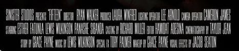
Hamidat Adesina
|
|
This is the first practice trailer we had created, and from the we collected information from the people who had watched our practice trailer, to find out what they did and did not like about our trailer, so we could make our trailer look as professional as possible.
|
|
CLICK LINK BELOW TO VIEW SURVEY:
|
|
|
This is our final trailer, and we have taken into account our audience feedback, and have decided to make changes based on what the viewers wanted, and what we also thought looked best.
|

We uploaded our trailer on Youtube and the data we gathered showed us how many people viewed our trailer, what age and gender viewed our trailer. The analytic feature showed us what platforms were used in order to watch the trailer and what country the trailer was being watched in. As of now, our video has received 36 views, 2 likes, and one comment.
|
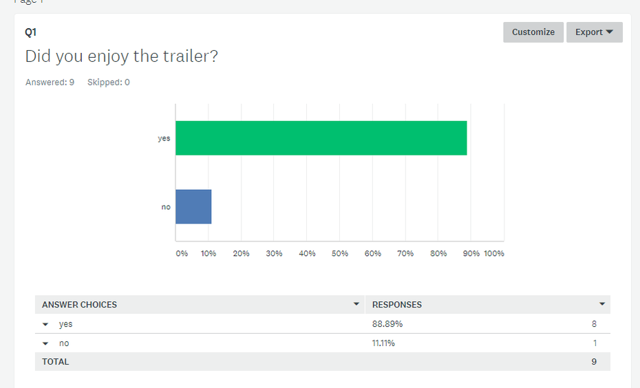
The first question shows that our trailer is very effective as 90% of the 9 people that took the survey liked it. This therefore suggests that majority of the people who watched our trailer enjoyed it.
|
|
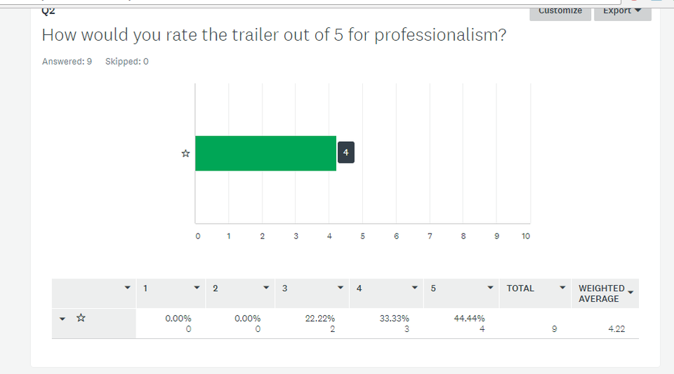
The second question shows that everyone rated the trailer 3 or more stars in regards to how professional it looked, the majority rating it 4 stars. This means that our trailer was successfully portrayed as professional as our rating was voted 3 stars or above by everyone who took part in the survey.
|
|
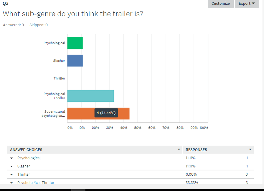
The third question is about what sub-genre people think the trailer was, and majority voted supernatural psychological thriller, with 44.4%. That is the sub-genre we were going for, meaning that our trailer made sense, and followed a the conventions of that sub-genre. Only one person voted it as a slasher, and perhaps that is because there was some blood involved in some of the scenes, although there is nothing graphic shown in our trailer, like a slasher would have.
|
|
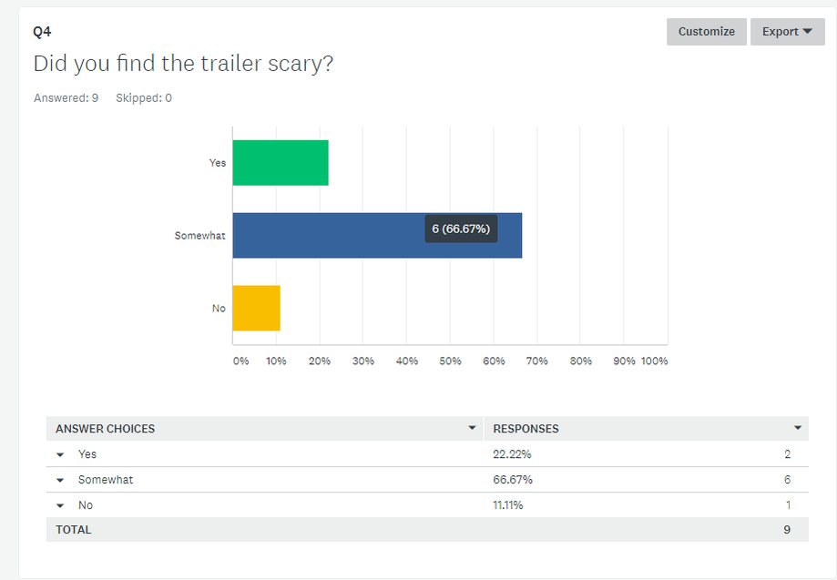
The fourth question asked the fundamental aspect of horror, Whether or not the audience found the trailer scary. 22.22% said that the trailer did scare them, 66.67% of the people said that the trailer was somewhat scary, and 11.11% people said it was not scary. This feedback meant that at some parts people found our trailer scary, but the feeling was not consistent throughout, this may mean that they are horror fans and therefore not easily scared or that we would have to make the trailer more shocking, so that people have that scared feeling throughout.
|
|
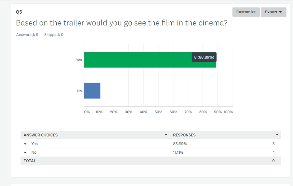
The sixth question asked the audience whether the trailer made them want to see the film in the cinema. 88.89% said yes, therefore suggesting that it successfully portrayed itself as an exciting horror film and enticed the audience. 12.11% said that they would not go and see this film in the cinema, and when speaking to the person that gave this feedback, they enclosed that our sub-genre was not their favourite.
|
|
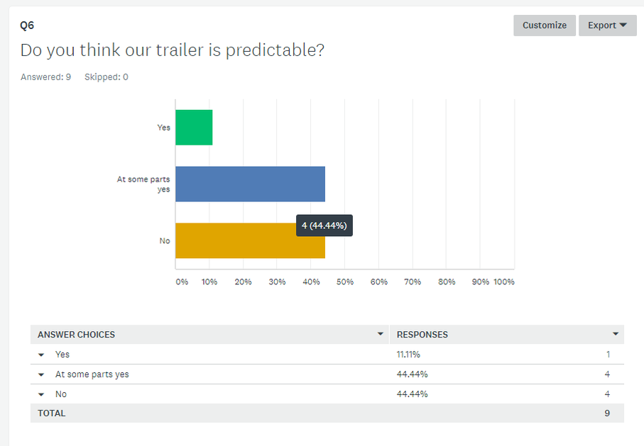
The sixth question is us asking whether or not people found out trailer predictable, and there was a tie in the votes, with 44.4% of the people voting no, and 44.4% voting somewhat. This means that overall, people did find that our trailer was predictable at some parts, but also not predictable.
|
|
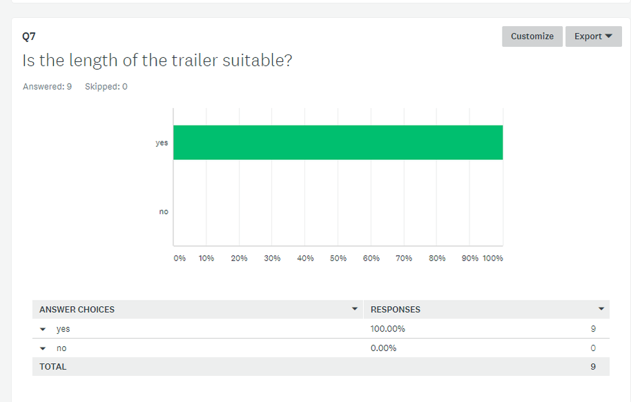
The seventh question is asking if people thought that the length of the trailer was suitable. Our trailer is 1 minute, and 100% voted that the length was suitable. This means that our trailer was not too long that people will get bored, and not too short that it did not show enough information for people to find out more.
|
|
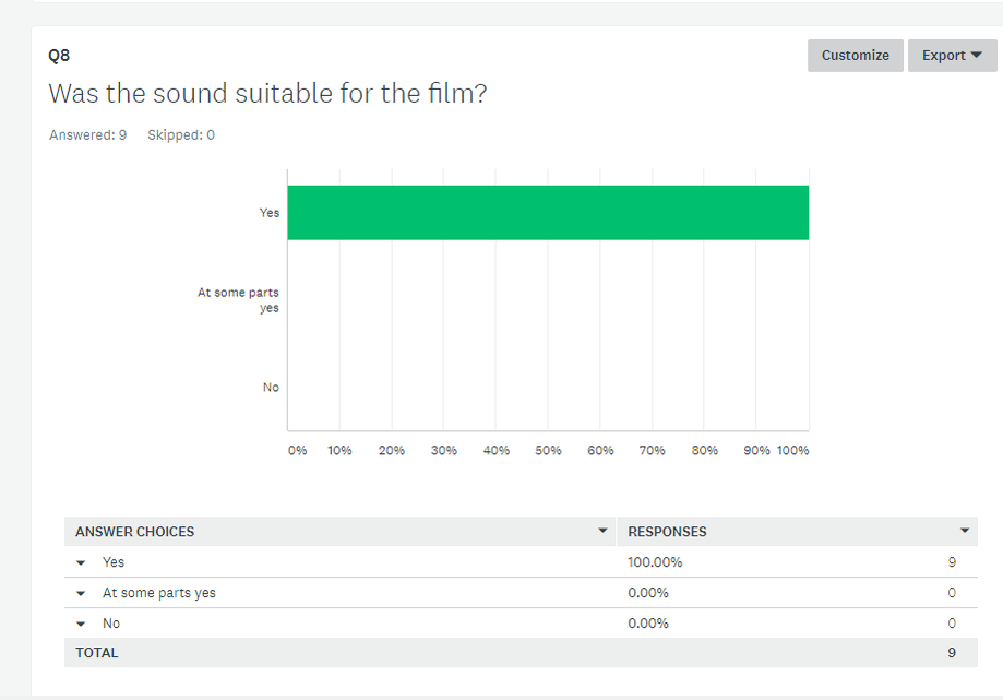
The eight question is asking whether people found the sound suitable for the trailer, and again, 100% of the people voted yes. This means that the sound helped with the mood, and it helped to give off the horror feel, as our music was ominous, and included many conventions of a horror film.
|
|
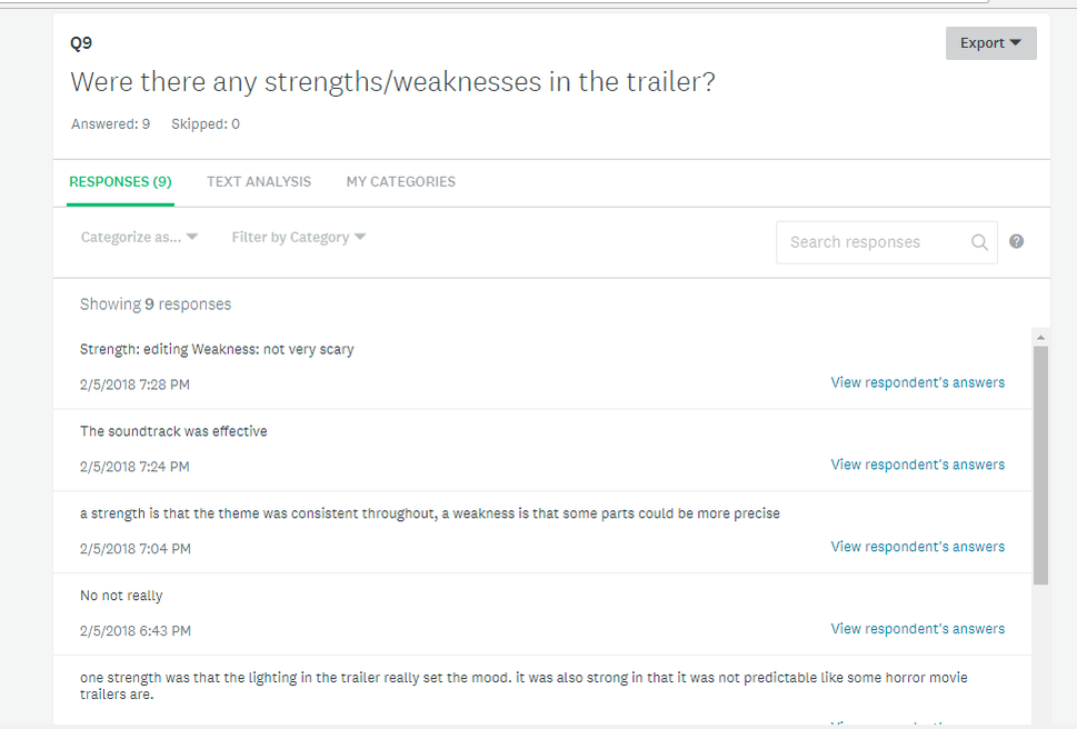
We asked if there were any strengths/weaknesses in the trailer, and the strengths were that people found the editing and the soundtrack to be effective, and it had a consistent sub-genre theme. However, the weaknesses were that people believed some parts could be more precise, and that its was not found very scary. To improve on this, some cuts could be made to certain parts of our trailer, to make it look more precise, and to help build up the tension, helping it look more scary.
|
|
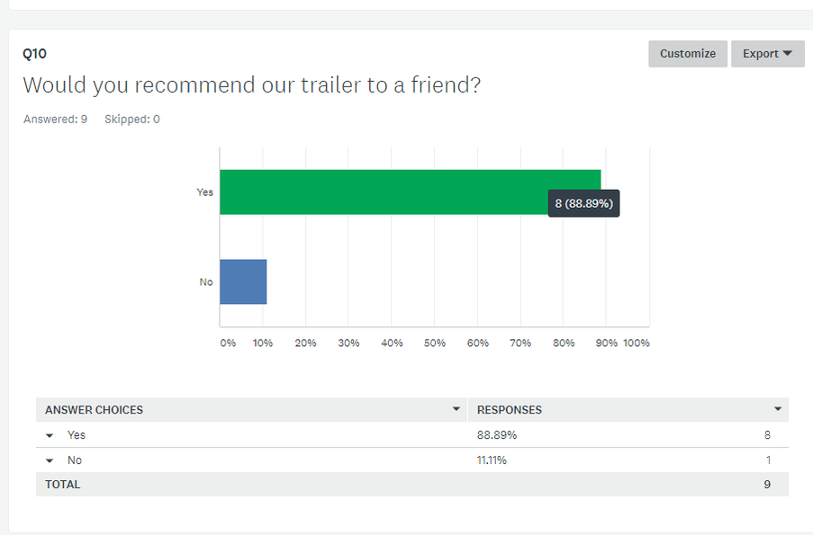
Our final question asked if people would recommend our trailer to a friend, and 88.89% of people would say they would recommend it to a friend, meaning that overall, our trailer must have had a great impact on them, to the extent that they would tell people they know about our trailer.
|
Trailer Analytics
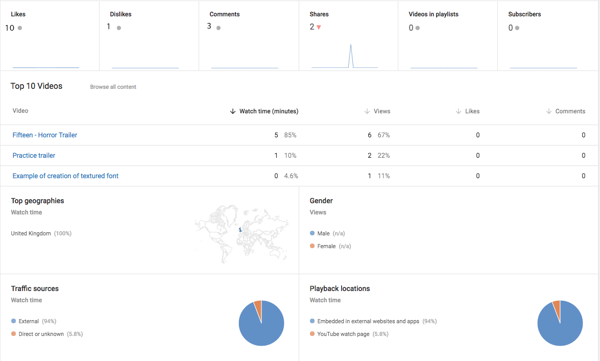
The analytics show us who has watched our trailer, where these people live, and how they have viewed our trailer. Our trailer has received 10 likes, 1 dislike, 3 comments and 2 shares.
Trailer Evaluation
The feedback that we received from our target audience was very helpful as they offered a range of comments on our work. All of the people that we asked thought that the non-diegetic sound was very effective and that it matched the footage well, and many of the positive comments on our strength mentioned how the sound made the piece of work much more interesting. This therefore means that our sound design was successful as it achieved its aim of setting an eerie atmosphere and scaring the target audience. 44.44% of the people that we asked however, said that our trailer was somewhat predicable; this may effect the reaction of the audience as the visceral/emotional pleasure received from watching the trailer may not be as much due to them knowing what is going to happen next. We thought that the audience would easily be able to distinguish between the genres and identify our trailer as a supernatural/psychological thriller, however 11% thought that it was a slasher film. The viewers therefore could not see what the important part of the trailer was, which is the man, the woman and the doll. 100% of the people who took the survey said that they would recommend our trailer to a friend, which means that our desired effect was reached, as the more people know about our film, the more attention our film will get, which is an important part of marketing.
