Audience Research & Moodboards
Examples to watch before answering
In conclusion, on the majority of the questions I asked, most answers were clear as to what the audience would want to see in our trailer. For example, for questions 1,2,5,6 and 10 there was a dominant public vote, especially for question 10 as each person I used as a part of my research voted 'Yes' in favour for a cliffhanger at the end of our trailer.
However, for question number three there was a difference in answers as each person decided to choose various possible outcomes. For example, the question regards how the lighting should be kept throughout and whether it should change or whether it depends on the deeper meaning (sub-text) on the trailer. On the contrary though, since just over 57% voted to keep dark and dim lighting all the way through the trailer i am going to go with the majority vote, since audiences are clearly more scared when there is an uneasy atmosphere straight from the beginning instead of building up to it with along with the change in lighting.
Furthermore, for question 7, the results are nearly equal. However, when speaking to some people whilst making this questionnaire I believe I could of worded the question better and some people made a point that they feel fades are important, however text is not. Therefore, I believe I am going to ensure that there is not a big focus on the text in our trailer, but making sure I include many editing techniques to make the trailer more interesting and effective on viewers.
Next I decided to add in two questions where the viewers themselves had the choice to have their say on what aspects they specifically like when watching horror trailers. From the results I have found out that lighting, props, blood and suspense music are the most important components into what makes a horror trailer create real visceral and emotional pleasure; which is the main aim of horror films.
Magazine Questionnaire
1. What colour scheme should the magazine use?

|
|

|
|
2. Should the masthead be in front or behind the dominant image?
|
|
3. Should the dominant image be a poster of the movie? Or a shot from the movie?
|
|
4. Should there be multiple images on the cover?
|
|
5. Should the masthead be simplistic or complex?
|
|
6. Should direct address be used?
|
|
7. Should there be more copy, or more of the image?
|
|
8. Should the magazine feature a strap line, perhaps one related to the plot of the movie?
9. Should the front cover include other similar films?
10. Should the magazine contain many visual elements?
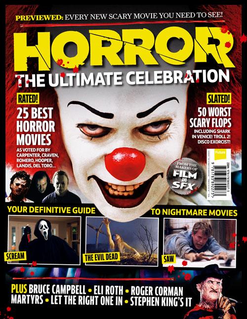
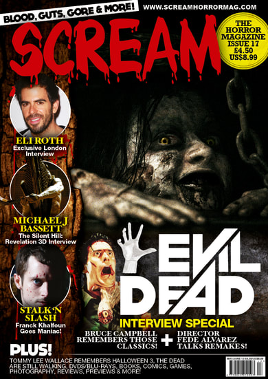
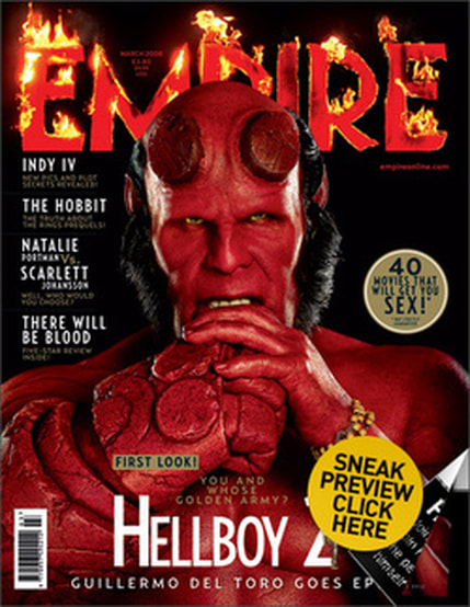
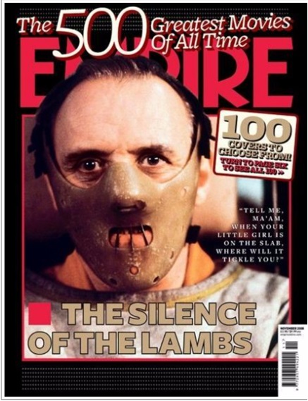
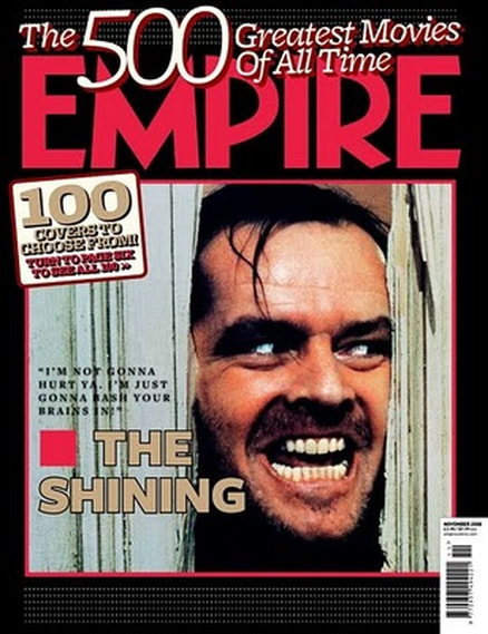
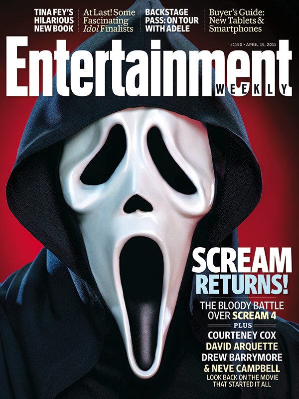
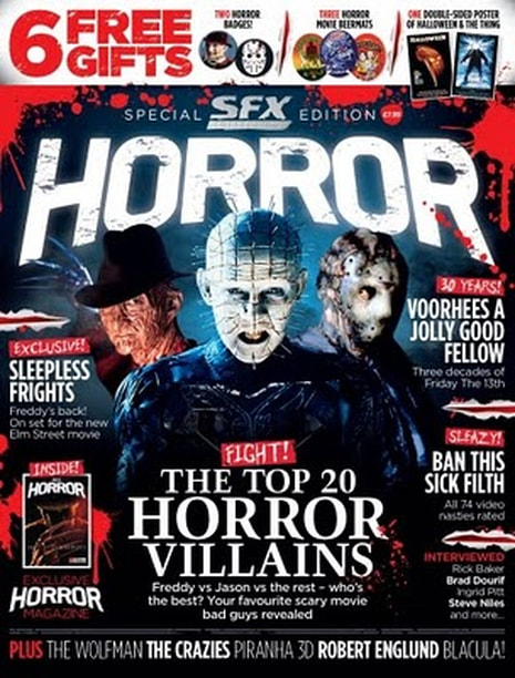
When looking at the results I have gathered, I feel that many of the questions have received the same answers, which therefore shows that my specific target audience enjoy looking at a particular type of magazine, that contains conventional aspects but also unconventional elements. The overall result I have gathered is that teens enjoy visuals and are less interested in copy, therefore, a large dominant image is extremely important, the magazine should look very simplistic and professional, almost like a cinema magazine such as EMPIRE, which takes the less busy approach, unlike the horror magazine such as SCREAM.
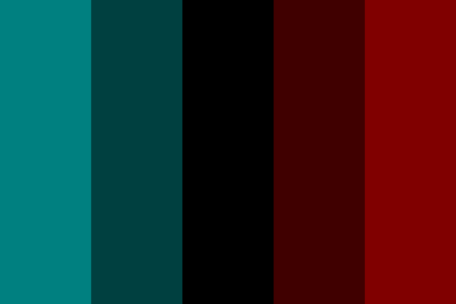
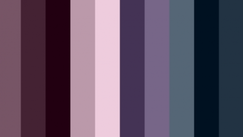
Moreover, the main colour scheme that should run through the magazine is red black and white but also a mix of deep teals and greys as well, since all these colours have different conventions that fit into the horror genre, such as red symbolising blood, black connoting darkness, white connoting purity, grey connoting loneliness and teal connoting a mellow depressing atmosphere they will all have a relatable deeper meaning.
In addition, most of the people I asked felt that it would be more visually pleasing to the eye if the magazine used a poster style image for the front cover, instead of a shot from the movie, this is again to flow better with the other forms of media we will be creating and help make the movie more recognisable as audiences would be familiar already with a similar image.
Also, the majority of people I asked also dominantly voted that the main image should be in front of the magazine masthead as therefore, this then means that the magazine will predominantly be all about the film and nothing can take away from this. I will do this by editing the image and laying it over the middle of the cover title since it should still partly be shown to let readers know which magazine they are reading.
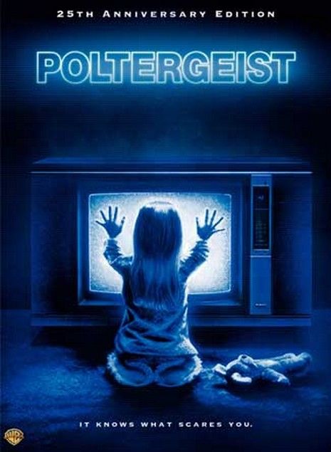
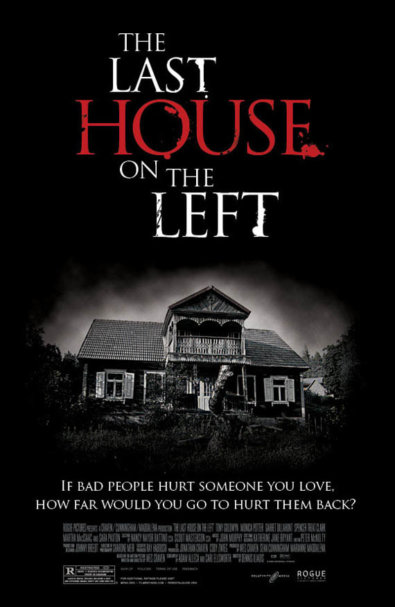
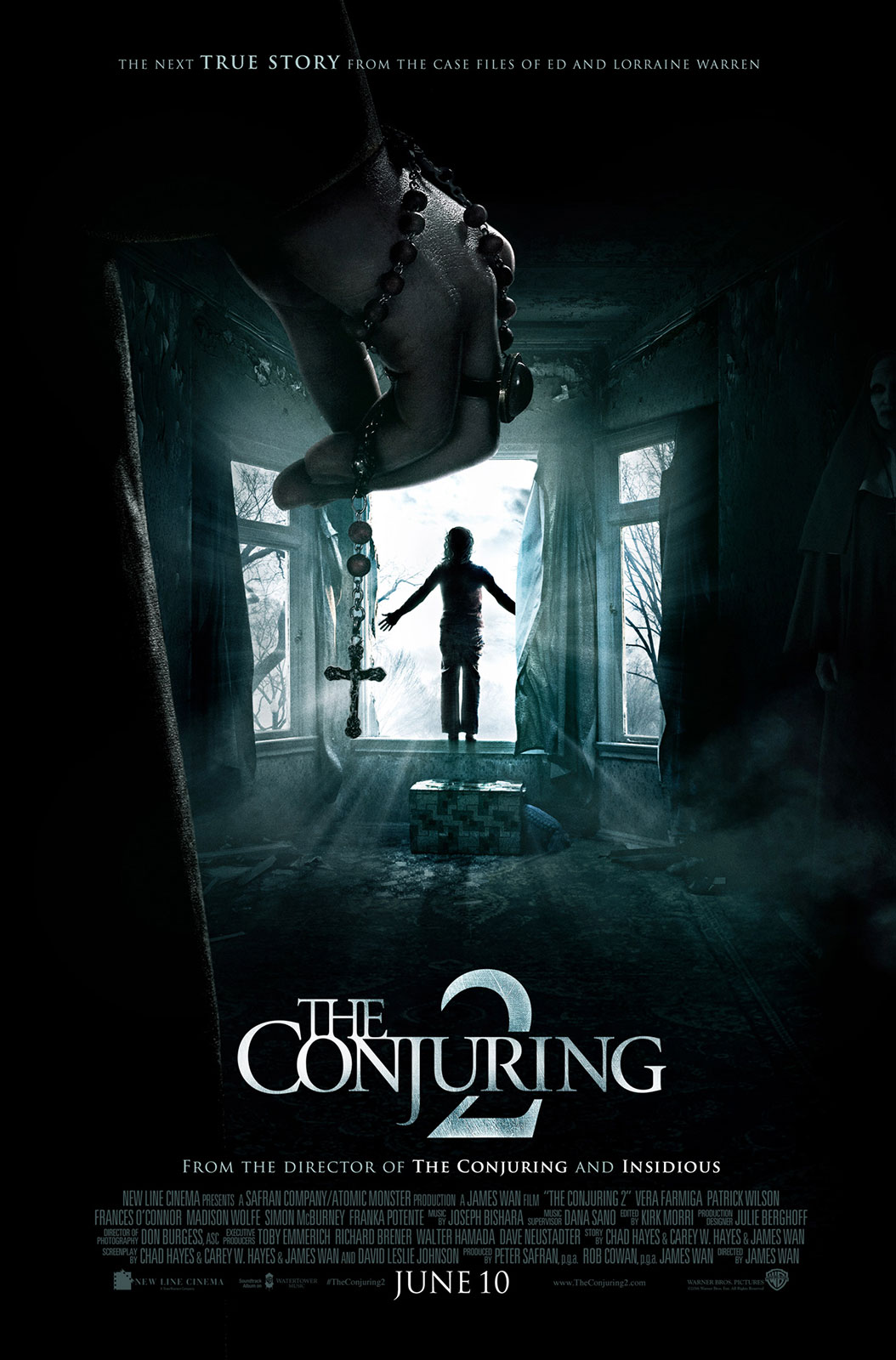
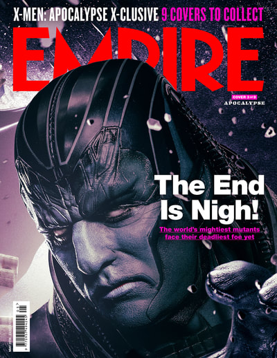
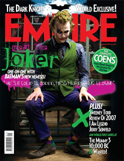
Example posters to review before answering
|
|
|
|
|
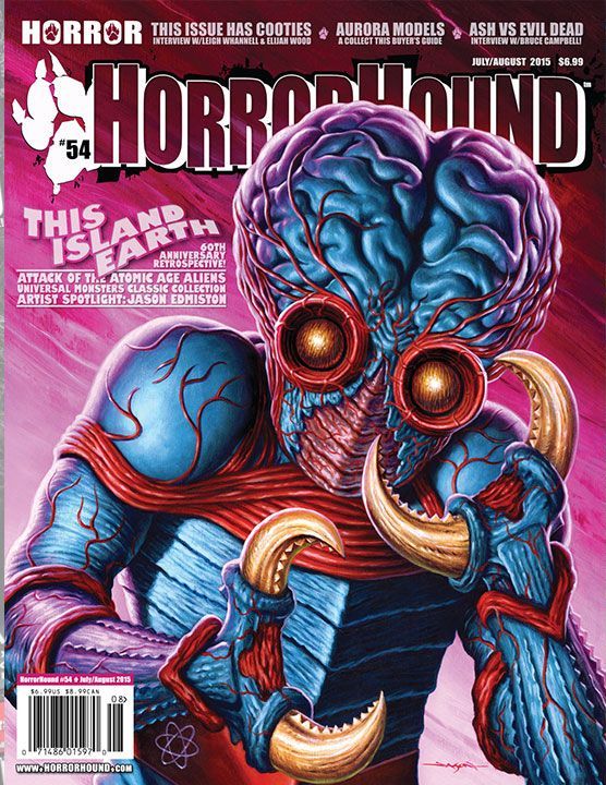
As for the poster analysis, I found that again people enjoy when media referencing the same film follows a house style throughout their posters, magazine covers and trailers in order for the film to be instantly recognisable to the public as that film. Therefore, keeping the colour scheme, fonts, layout style, ratio patterns and amount of images is all very important to ensuring our products look professional and aesthetically pleasing.
In addition, if we are going to use a character from the film in our poster the majority vote from our target audience decided that they would prefer a close up shot of them taking up the whole space of the cover. This could possibly be because it immediately grabs the audience’s attention as the image is so dominant, also, the direct address that would be used by character would help to make the film more personal to viewers since they feel obliged to go and watch it.
What’s more, ideas about weaponary being shown in the poster also came up a few times which people within our target audience personally write themselves on question 8 of my survey. Therefore, because of this result I feel that we should include one of the main weapons that the main character in our film uses within the close up due to the fact that it gives more of a insight into the plot and mis-en-scene that would be included in our trailer; which will intrigue the audience a lot more.
Set Design Moodboard

Prop Design Moodboard

Sub-Genre Moodboard Psychological/Slasher

Colour Moodboard

Posters & Magazines
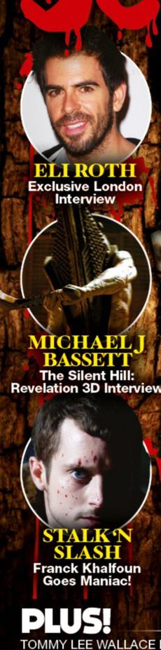
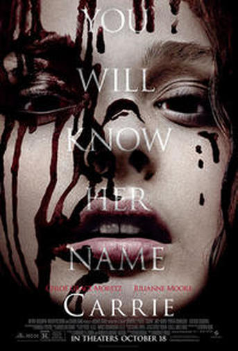
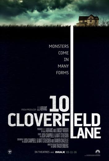
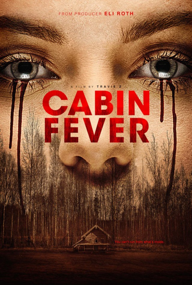
Magazine covers and film posters I have taken inspiration from
Click the images to view a Thinglink document.

Hand-drawn Poster and magazine rough designs
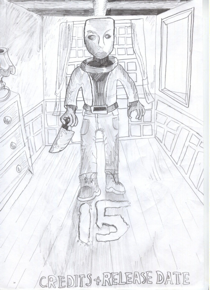
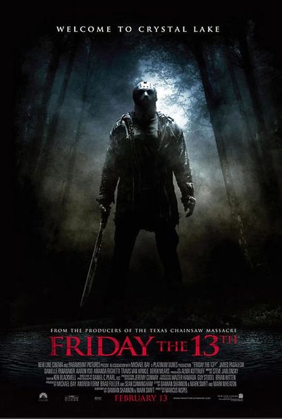
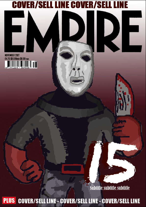
In this film poster draft, we took inspiration from Friday the 13th (2009)’s poster by including a medium long shot of one of our concept’s antagonists : one of the Masked Men, whilst wielding a bloody knife. The iconography of the Mask and knife allows an audience to instantly recognise that our film is part of the horror genre, In particular slasher films, as these have become recognisable conventions of the genre over time. We can also use colours associated with horror, such as red, white and black to further suggest the genre in our final designs. We also believe that we have chosen a suitable pose for an antagonist, as the perspective gives a feel for the character looking down upon the viewer. The light will come from behind, via the window allowing for a dark shadow of their figure at the front. The contrast between the light and dark creates a binary opposition, as darkness symbolizes evil/death, while white presents purity. This could be a subtle forshadow to the film’s twist, that in reality, the masked men are part of the good side for punishing travis the murderer.
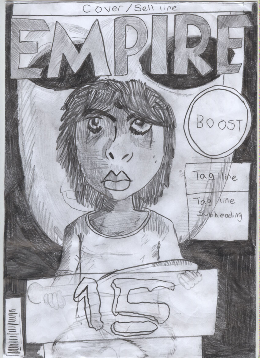
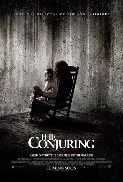
For this Magazine cover draft, we took inspiration from The Janruary 2017 Issue of Empire by including a medium close-up our concept’s Victim sitting wielding her baseball bat in front of a large close-up of the masked men (The main ‘antagonist’)’s masks. As a mask is conventional iconography of horror, it allows the viewer to recognize the genre instantly, and helps to represent the idea of unknown identity, which subtly foreshadows our concept’s twist relating to our ‘protagonist’s true identity. Similarly to Empire’s cover, we have made sure our victim faces away from the camera. This is to separate the world of the text from reality. I have also included all the essential conventions of a magazine cover, such as a cover/sell line to boast about the contents of the magazine, A bold red masthead (Red is a conventional horror colour, and represents blood, a convention of the slasher sub-genre, which our concept is a part of.
|
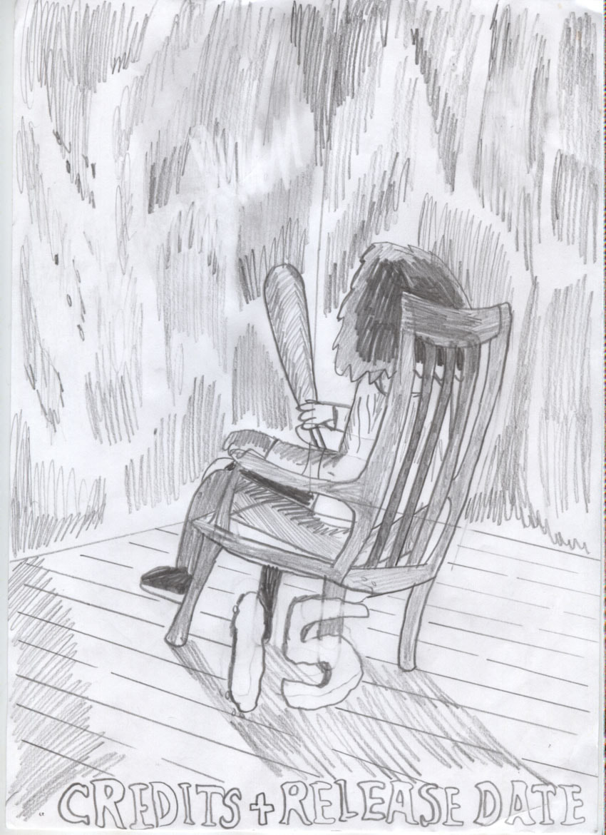
For this film poster draft, we took inspiration from The Conjuring (2013)’s poster by including a long shot of one of our concept’s Main Victim (and true antagonist), sitting while wielding a baseball bat. Our character wears a white shirt, which is typical for slasher victims to show the blood stains caused by the antagonist. White is also used to represent purity, which is a consistent theme of our concept, as it focuses on a once innocent child, who loses her innocence after her mother is murdered. However, it turns out that they are actually the murderer, reliving the lives of their victims in hell for eternity. In our final design, we plan to use colours associated with horror, such as red, white and black to further suggest the genre in our final designs, as these colours are typically associated with the genre for what they represent : Red symbolises blood, black symbolises death etc. We also believe that we have chosen a suitable position for our protagonist, as the audience being unable to see her face directly, foreshadows the twist that this is not her true identity.
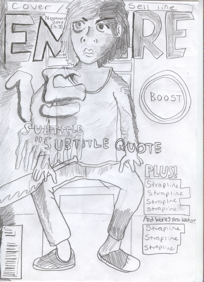
For this Magazine cover draft, we took inspiration from The Janruary 2006 Issue of Empire by including a medium long shot our concept’s Victim sitting in a chair wielding her baseball bat, isolated in her home, as well as taking inspiration from the spray paint graphics, which I have redesigned to resemble blood splats, which helps to establish the slasher sub-genre, as blood is a convention.
|
Digital Poster and Magazine Rough Designs
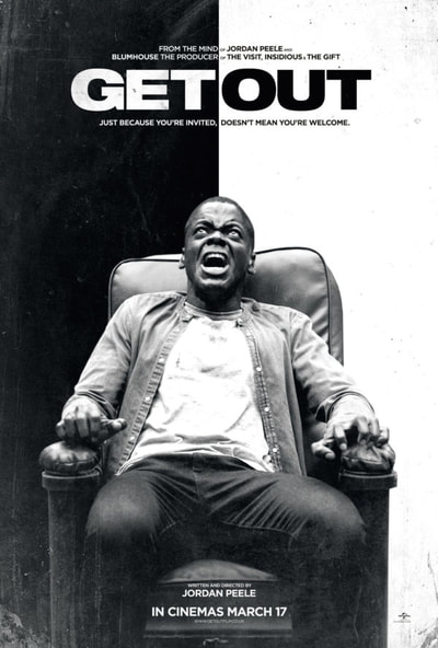
For this digital film poster draft, we have taken inspiration from 'Get Out's Poster, which focuses on the contrast between black and white. We believe this is an effective design choice, as it creates a binary opposition between what the colours represent. (Black=evil/death, White = Purity), a theme which is explored in our concept through the 'victim's confusion of their own identity, while they believe that they are pure and suffering without reason, they are actually suffering for their actions in their past life.
|
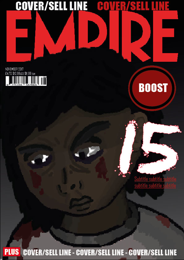
In this digital film poster draft, I have taken elements from May 2016's empire cover, to present a close-up of our main victim. close-up shots are frequently used in horror, as it directs focus upon the victim's facial expressions, suggesting fear and frustration. It also creates a feel of claustrophobia, an idea present in our concept, as our victim fees trapped in their own cluttered home after experiencing traumas outdoors as a child. I have also focused on adding strain to her face, to visually present the effect her traumas have had upon her.
|
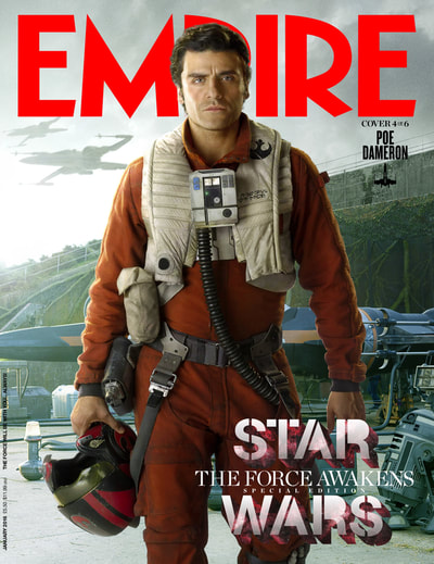
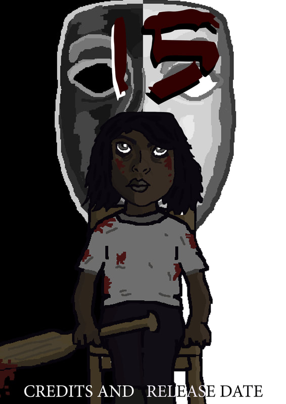
For this digital Magazine cover draft, we have taken inspiration from 'Janruary 2016's Empire cover, by including a medium long shot of one of our concept's antagonists : the masked men.
|
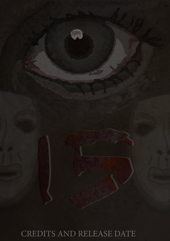
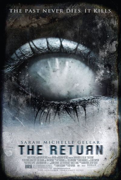
In this digital film poster cover, We have taken inspiration from the poster for 'The Return' by focusing on an extreme close-up of our victim's eye. we thought this would be an effective design choice, as this is a recurring layout for horror posters. Eyes carry many supernaturaul/religious concepts, such as 'The all seeing eye', as well as showcasing emotion, in the case of the horror genre : fear. for this design, I have experimented with adding texture to the image using a transparent layer of a photo of a rusting pole which i took, to add a strained effect, to create a similar effect to conventional horror posters, and present the physical and mental damage/wear our victim suffers through throughout the story.
|
